
I wrote some code to check my ordinal / clmm models against the data (and to learn to use ggplo2).
The function pred() is from clmm tutorial to calculate predictions based on the model. The function plot.probabilities3() is for plotting prediction and distribution form the data.
Update: changed extreme subject visualization. Area seemed not appropriate when average player is not always inside the area.
library("ordinal")
library("ggplot2")
pred <- function(eta, theta, cat = 1:(length(theta) + 1), inv.link = plogis) {
  Theta <- c(-1000, theta, 1000)
  sapply(cat, function(j) inv.link(Theta[j + 1] - eta) - inv.link(Theta[j] - eta))}

plot.probabilities3<-function(grid, model, comp.data=NULL, title="", ylim=NULL) {
  co <- model$coefficients[1:length(model$y.levels)-1]
  pre.mat <- pred(eta=rowSums(grid), theta=co)
  df<-data.frame(levels=as.numeric(model$y.levels))
  df["avg"] <- pre.mat[1,]
  df["low"] <- pre.mat[2,]
  df["high"] <- pre.mat[3,]
  if(!is.null(comp.data)) {
     df["freq"] <- summary(comp.data)/sum(summary(comp.data))
  }
  plot1 <- ggplot(data=df, aes(x=levels, y=avg)) + geom_line() + geom_point() +
  ggtitle(title) + ylab("probability") + xlab("") +
  geom_line(aes(x=levels, y=low), colour="#CCCCCC") +
  geom_line(aes(x=levels, y=high), colour="#CCCCCC")
  if(!is.null(comp.data)) {
     plot1 <- plot1 +
     geom_line(aes(x=levels, y=freq), lty="dotted")
  }
  if(!is.null(ylim)) {
     plot1 <- plot1 + ylim(0, ylim)
  }
  return(plot1)
}
The function is used as follows:
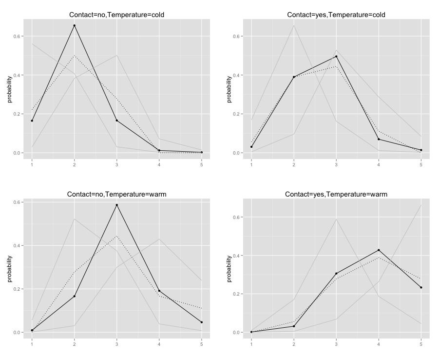
data(wine)
fm2 <- clmm(rating ~ temp + contact + (1|judge), data = wine,Hess = TRUE, nAGQ = 10)
mat_no_cold <- expand.grid(judge = qnorm(0.95) * c(0, -1, 1) * fm2$stDev, contact = c(0), temp=c(0))
mat_yes_cold <- expand.grid(judge = qnorm(0.95) * c(0, -1, 1) * fm2$stDev, contact = c(fm2$beta[2]), temp=c(0))
mat_no_warm <- expand.grid(judge = qnorm(0.95) * c(0, -1, 1) * fm2$stDev, contact = c(0), temp=c(fm2$beta[1]))
mat_yes_warm <- expand.grid(judge = qnorm(0.95) * c(0, -1, 1) * fm2$stDev, contact = c(fm2$beta[2]), temp=c(fm2$beta[1]))
dat_no_cold.tmp<-wine[wine["contact"]=="no",]
dat_no_cold<-dat_no_cold.tmp[dat_no_cold.tmp["temp"]=="cold",]
plot1<-plot.probabilities3(mat_no_cold, fm2, dat_no_cold$rating, title="Contact=no,Temperature=cold")

dat_yes_cold.tmp<-wine[wine["contact"]=="yes",]
dat_yes_cold<-dat_yes_cold.tmp[dat_yes_cold.tmp["temp"]=="cold",]
plot2<-plot.probabilities3(mat_yes_cold, fm2, dat_yes_cold$rating, title="Contact=yes,Temperature=cold")

dat_no_warm.tmp<-wine[wine["contact"]=="no",]
dat_no_warm<-dat_no_warm.tmp[dat_no_warm.tmp["temp"]=="warm",]
plot3<-plot.probabilities3(mat_no_warm, fm2, dat_no_warm$rating, title="Contact=no,Temperature=warm")

dat_yes_warm.tmp<-wine[wine["contact"]=="yes",]
dat_yes_warm<-dat_yes_warm.tmp[dat_yes_warm.tmp["temp"]=="warm",]
plot4<-plot.probabilities3(mat_yes_warm, fm2, dat_yes_warm$rating, title="Contact=yes,Temperature=warm")

grid.arrange(plot1, plot2, plot3, plot4, ncol=2)
(The code for creating the data frames containing only specific values is a quick hack. Did not figure out a better way to do it yet.)
The continues lines in the figures are predictions from the model. The gray lines show the random effect (5%-tile and 95%-tile) the dotted lines illustrate the actual distributions from the data.

Dear Petri,
I am trying to replicate your code but it’s nor working for me. Is the code “dat_no_cold.tmp<-winene["contact"]=="no",]" correct?
thank you
Hadi
The example has been my test code for the drawing functions. Something might have changed in a new versions of libraries.
Unfortunately, I do not have time to look at this in the near future; need to get a book ready.
Change that and similar lines of code to dat_no_cold.tmp<-wine[which(wine$contact=="no"),] and replace fm2$stDev by fm2$ST$judge in the expand.grid commands, and it will work